Themes & Customization
Laratic comes with beautiful, pre-built themes that you can easily switch between or customize to match your brand. Each theme includes its own color palette, typography, and border radius settings.
You can change the theme globally by setting the APP_THEME environment variable in your
.env file:
APP_THEME=laraticAvailable Themes
Laratic includes 14 beautiful, pre-built themes out of the box. Each theme includes both light and dark mode variants. Click on any theme to see it in action:
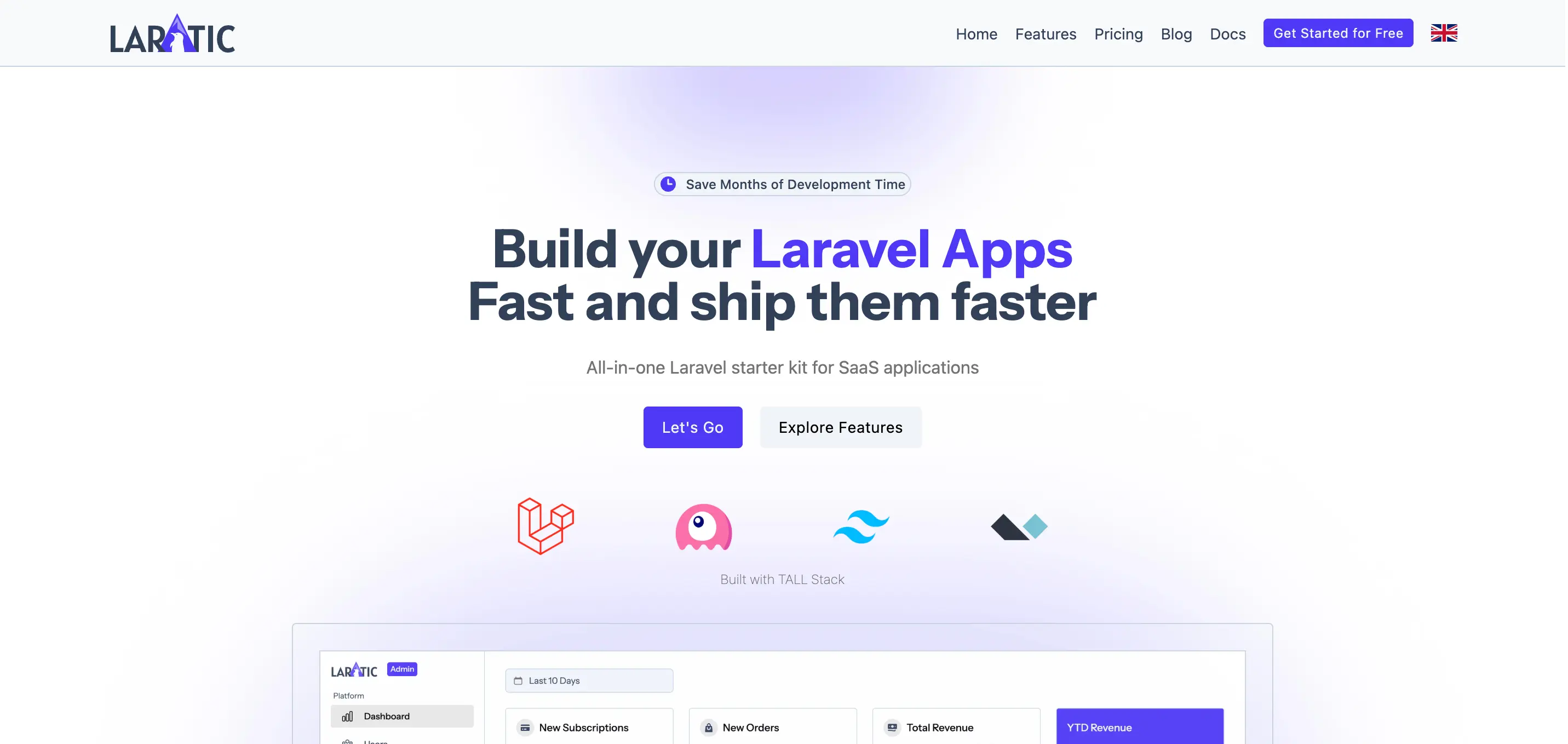
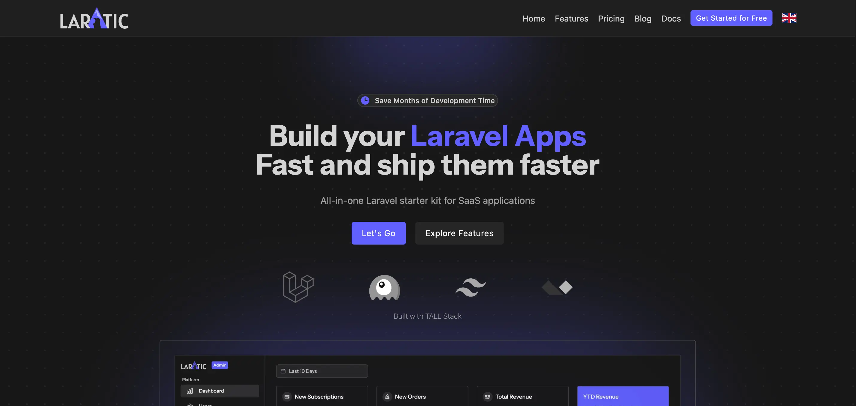
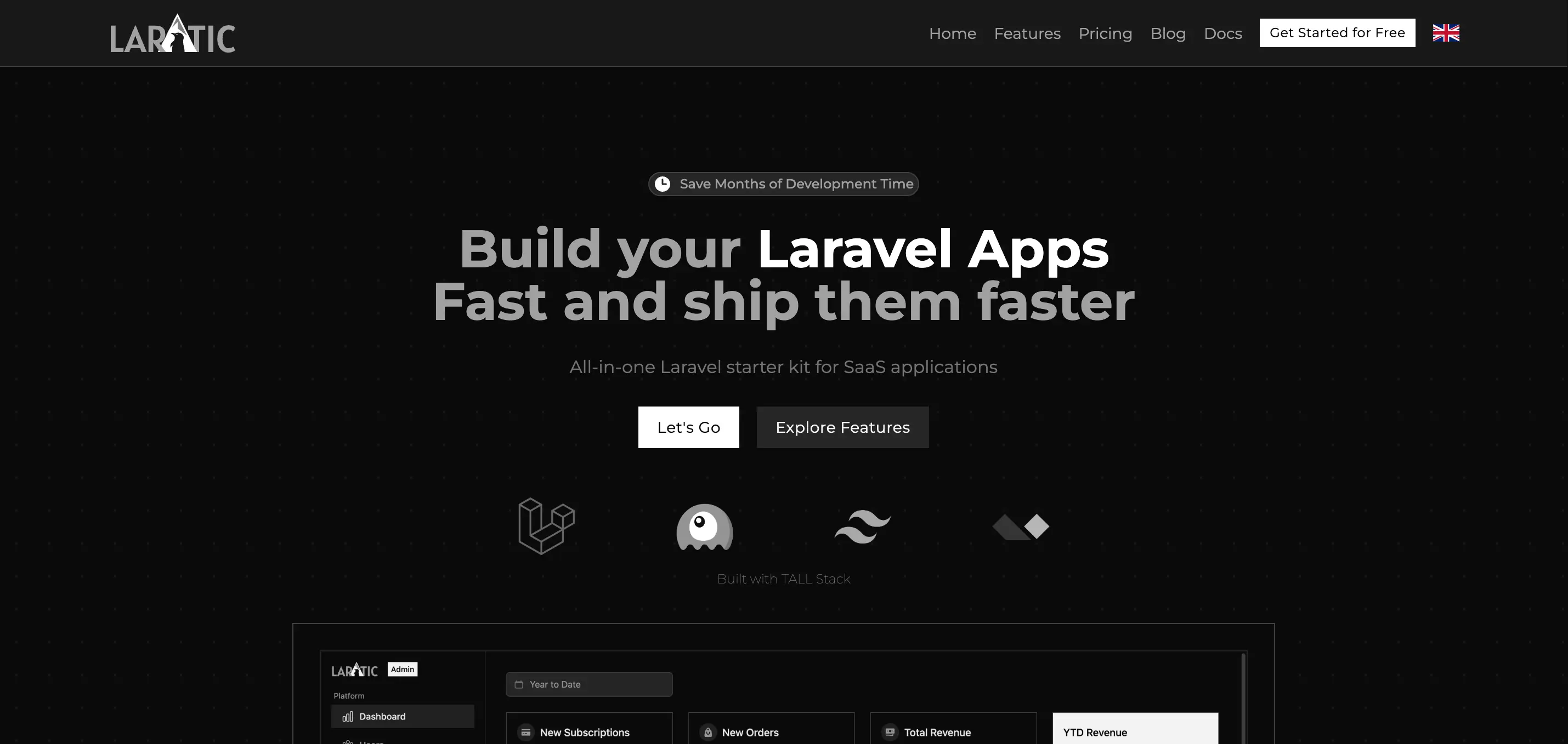
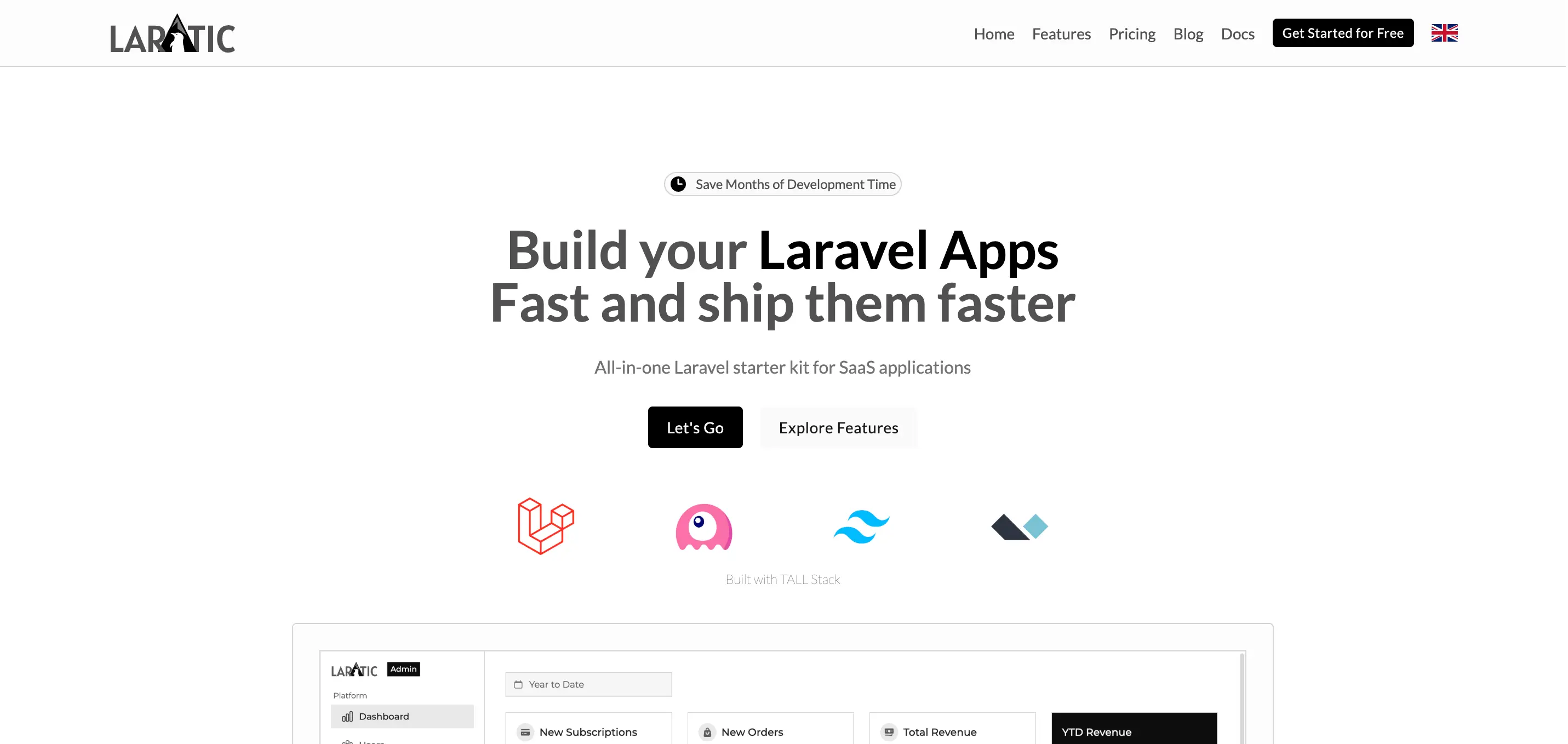
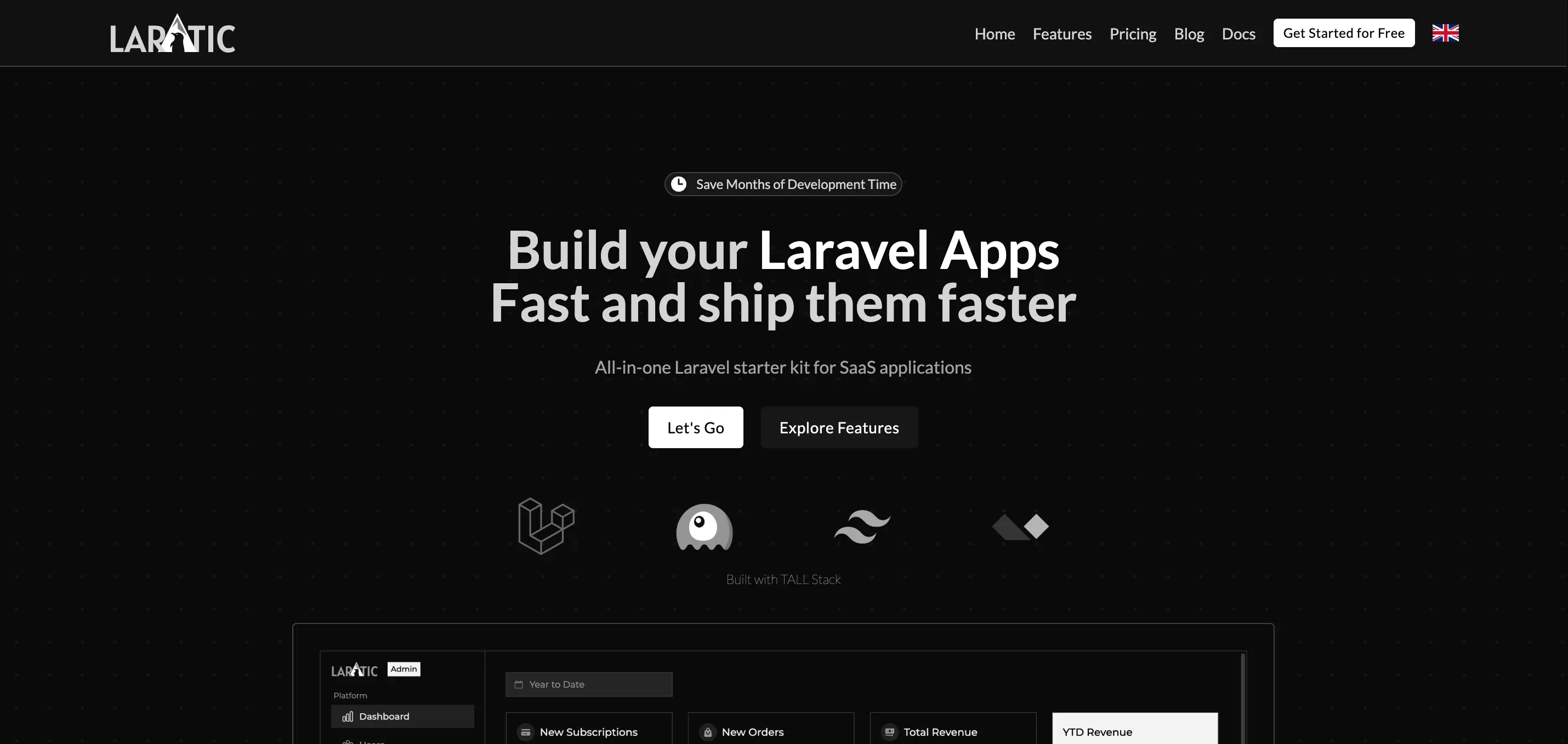
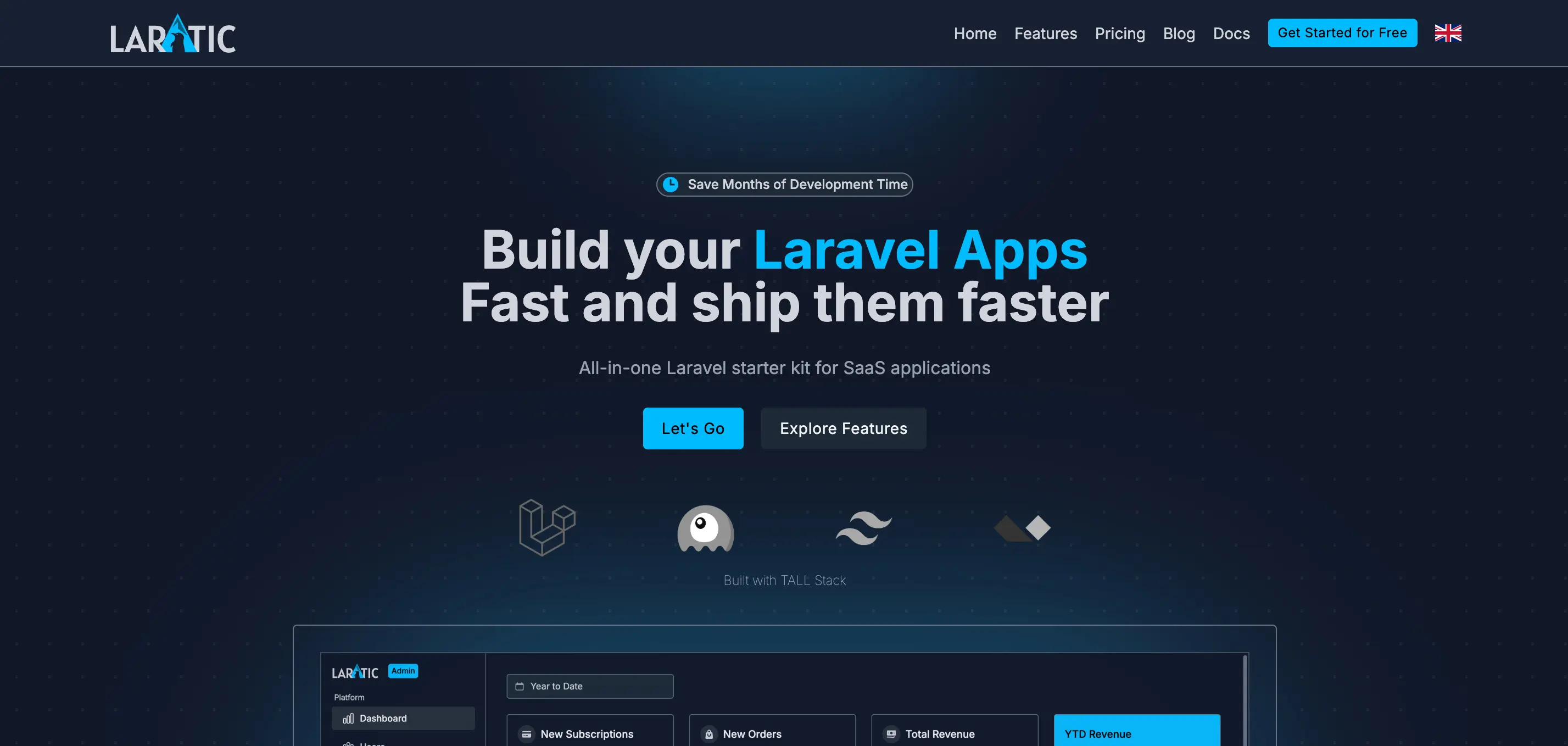
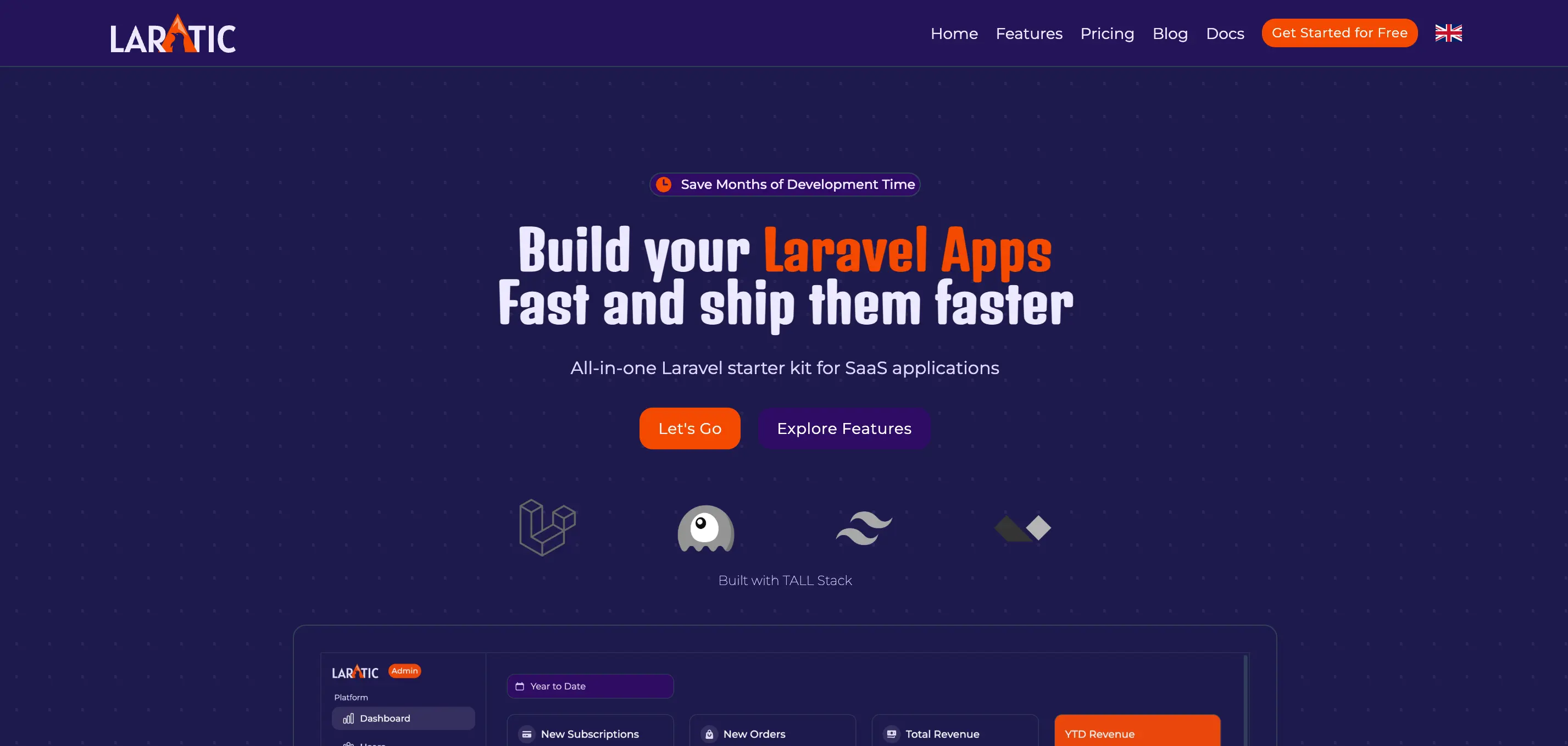
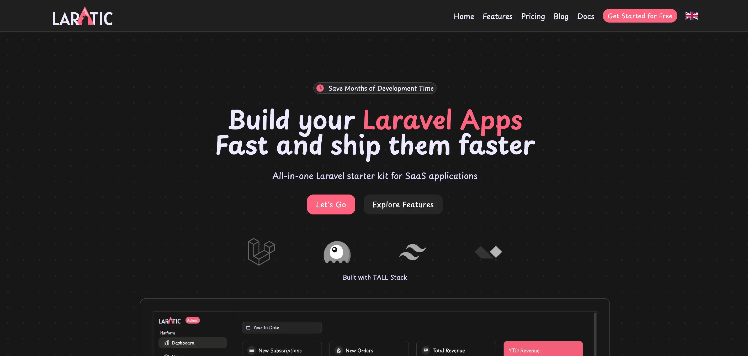
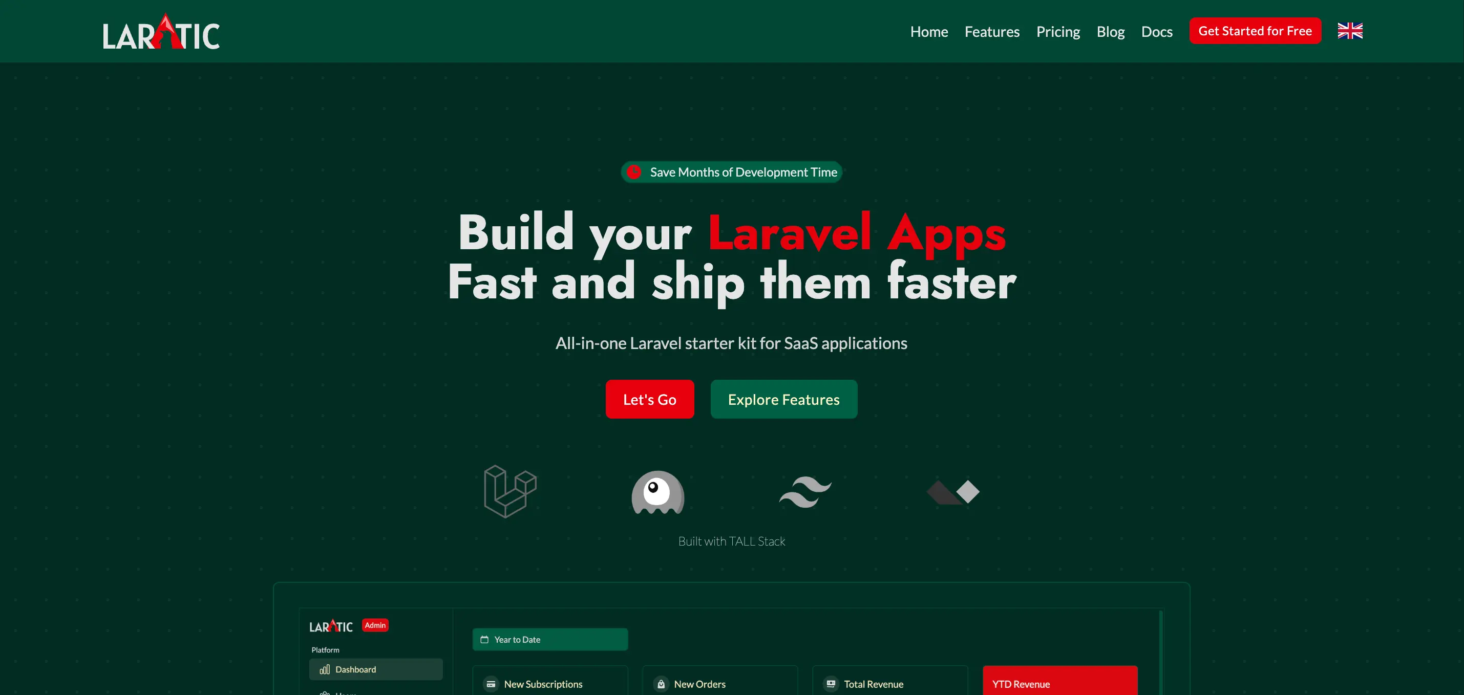
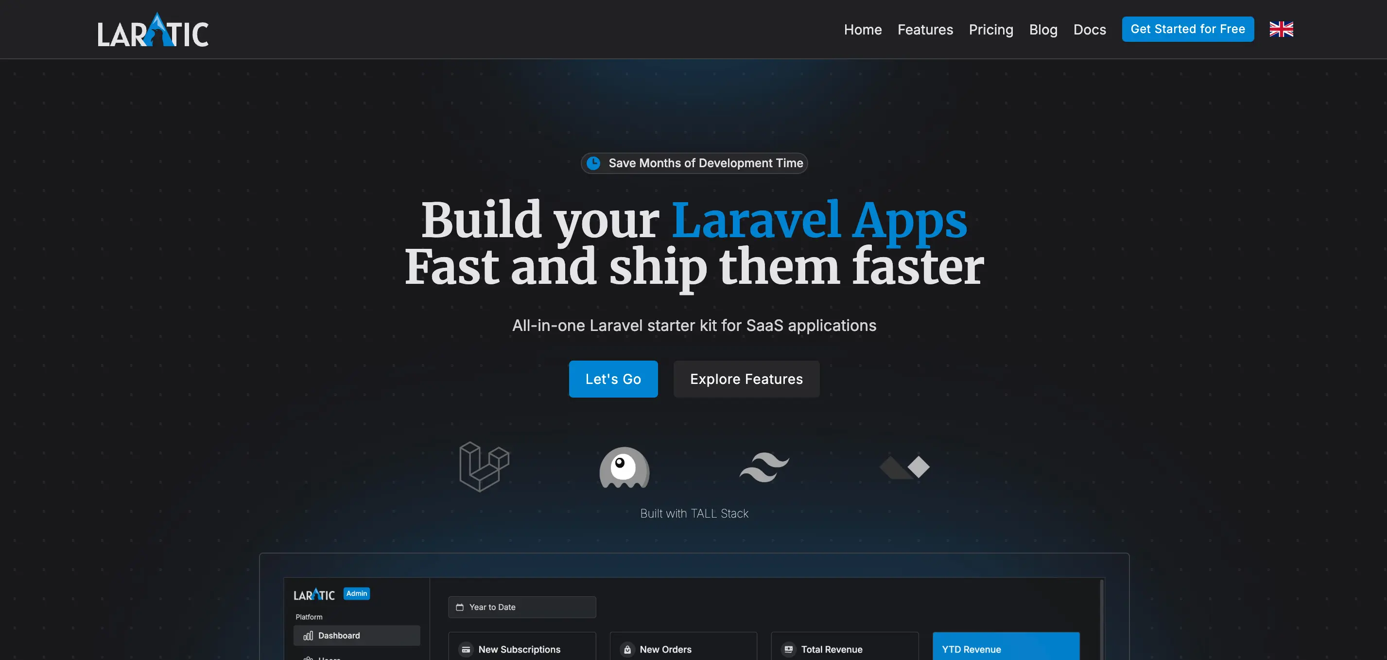
Laratic
The default theme with Instrument Sans font and indigo color scheme
laratic
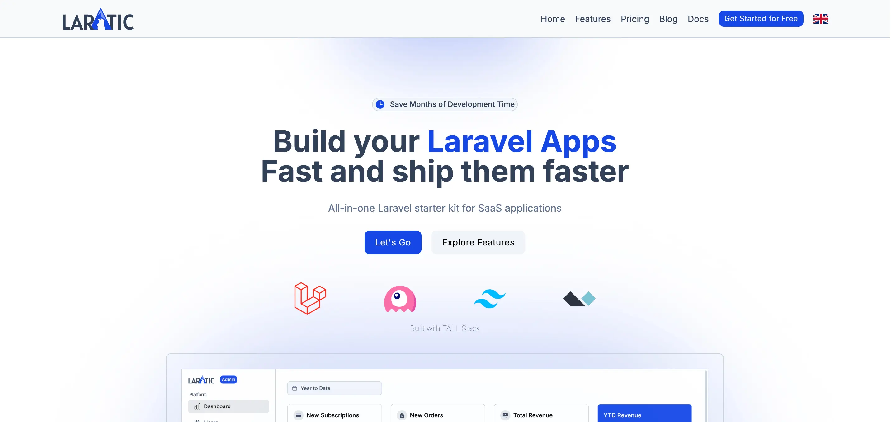
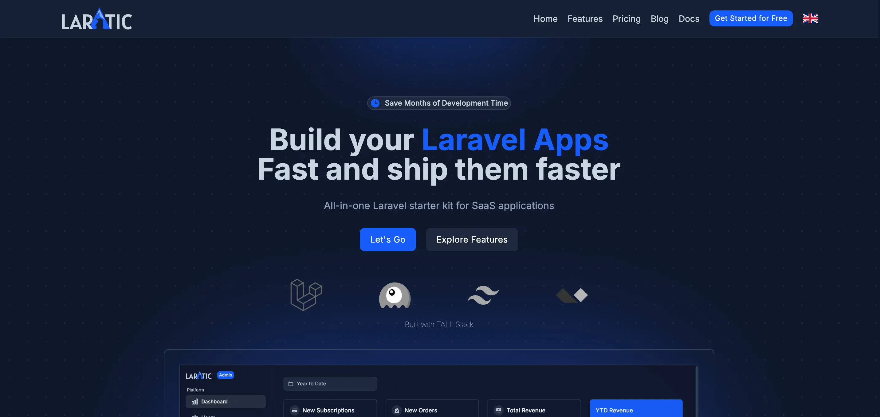
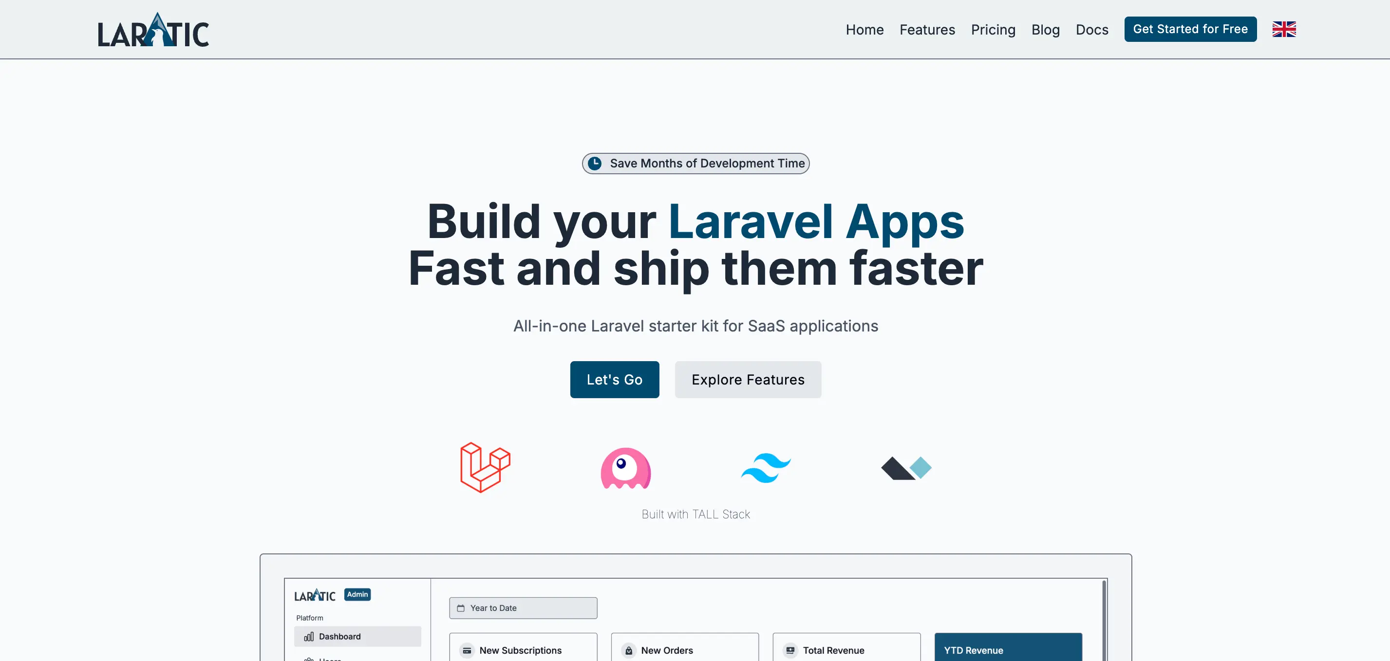
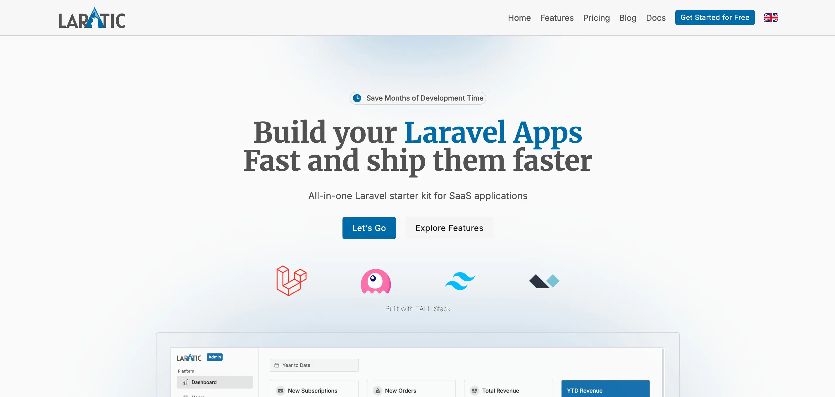
Arctic
Cool blue tones with Inter font
arctic

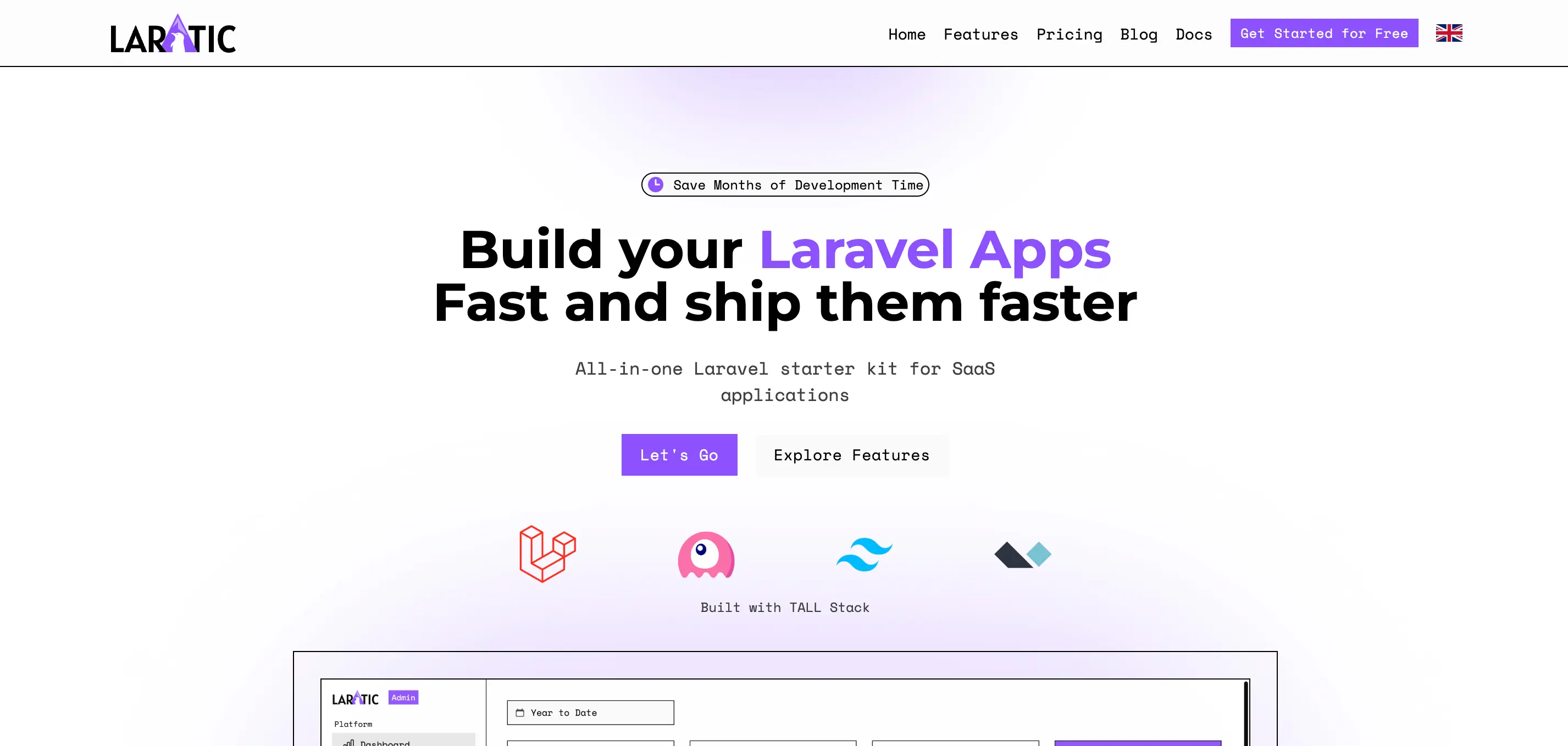
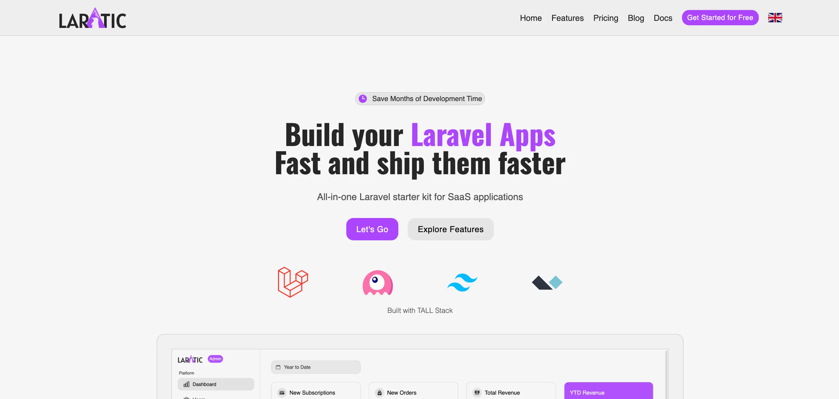
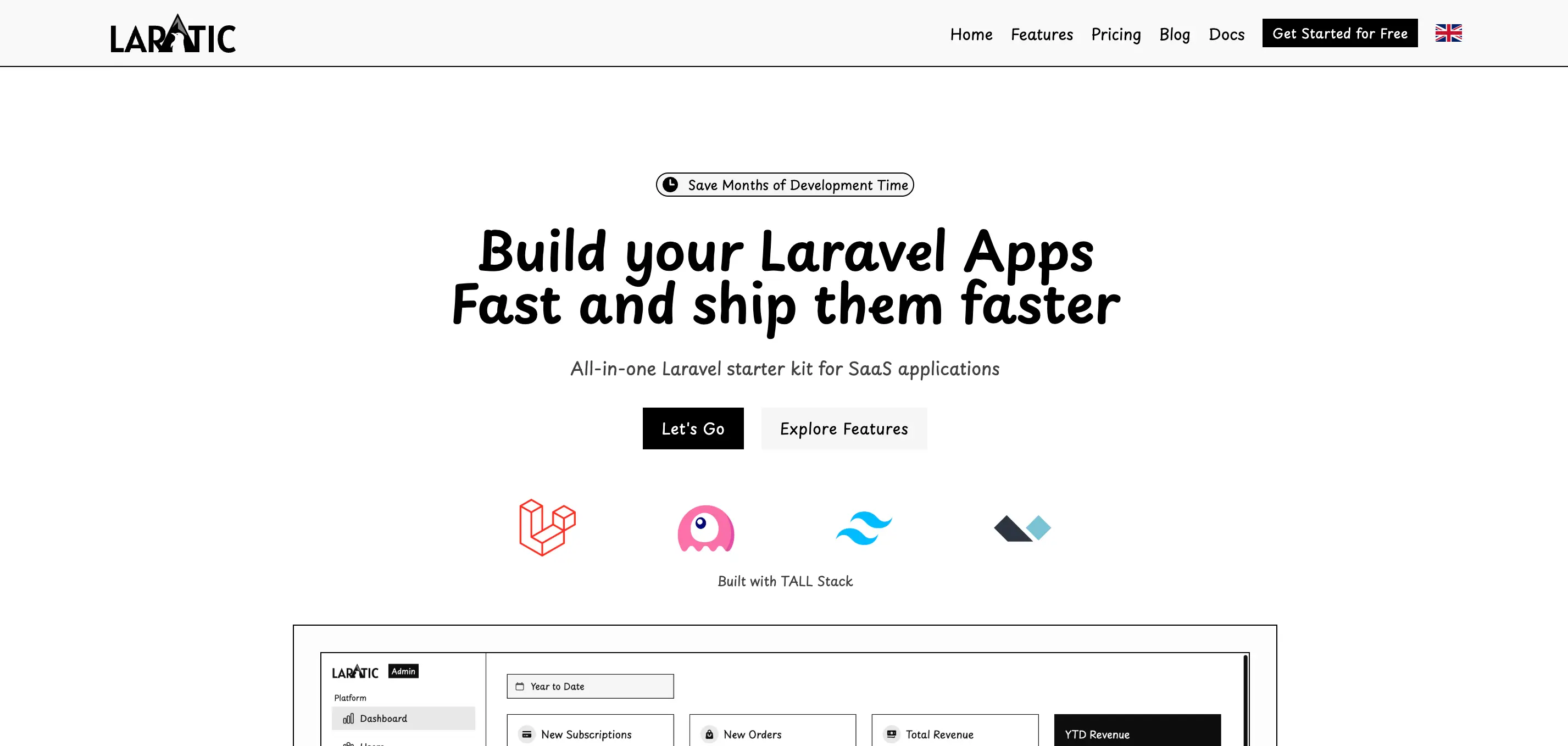
Minimal
Clean, minimal design with Montserrat font and no border radius
minimal
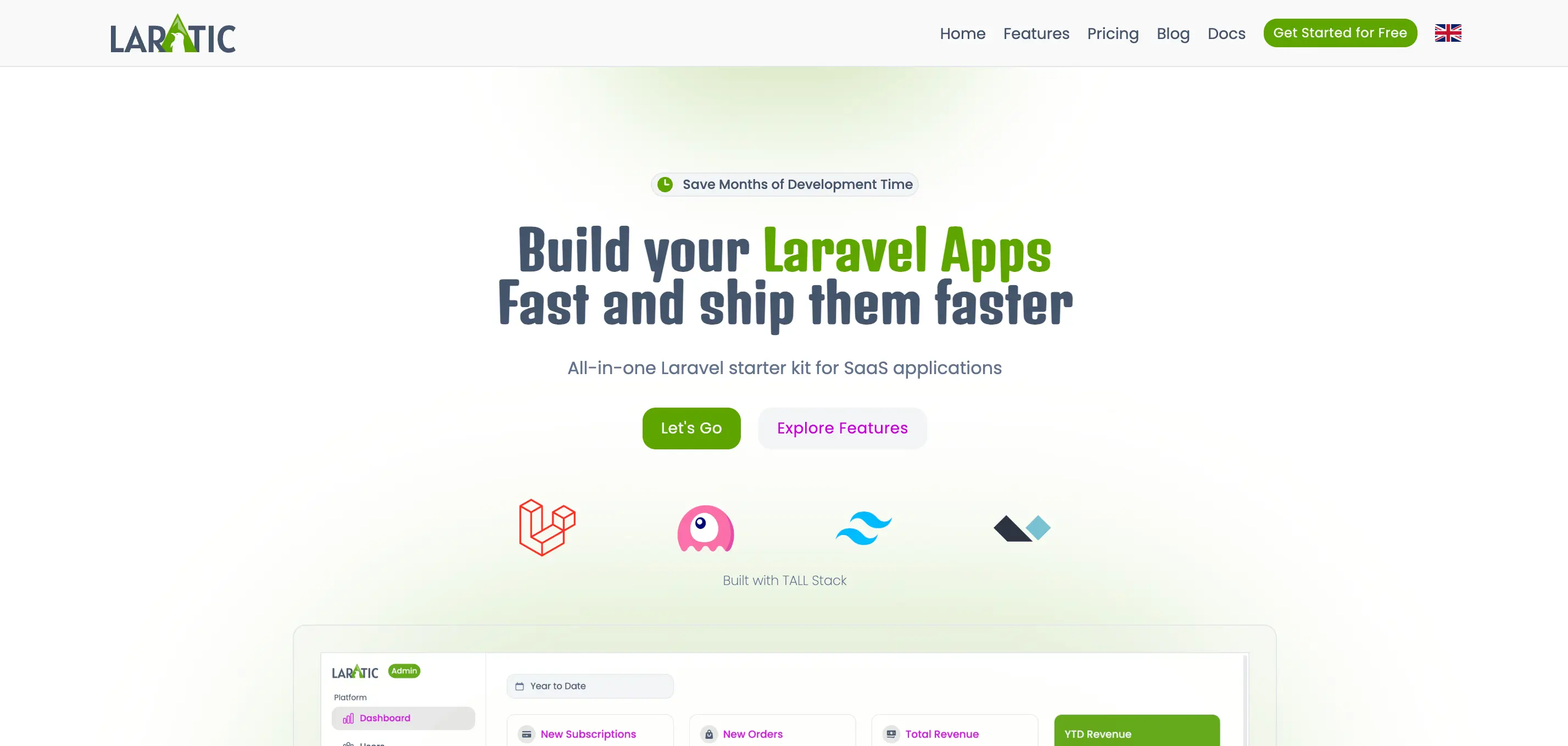
Modern
Modern aesthetic with Lato font
modern
High Contrast
High contrast design with Inter font for accessibility
high-contrast
Neo Brutalism
Bold, brutalist design with Space Mono and Montserrat fonts
neo-brutalism
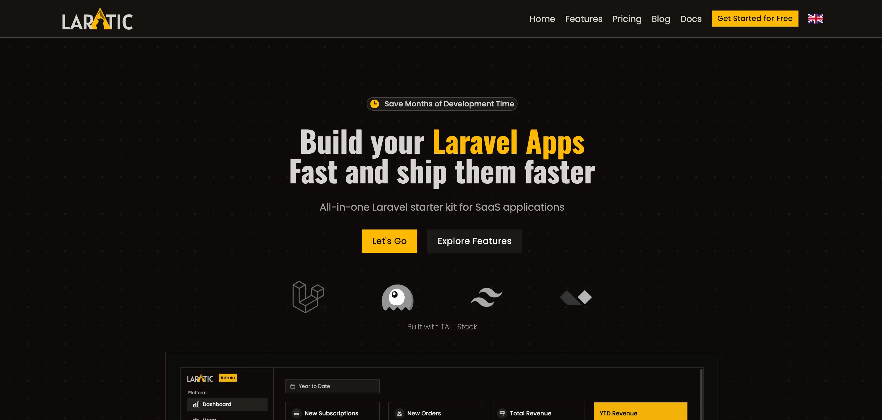
Halloween
Spooky theme with Poppins and Denk One fonts
halloween
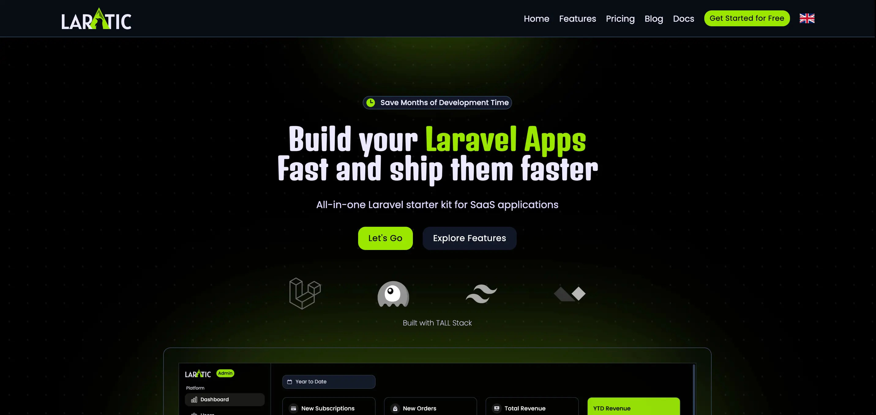
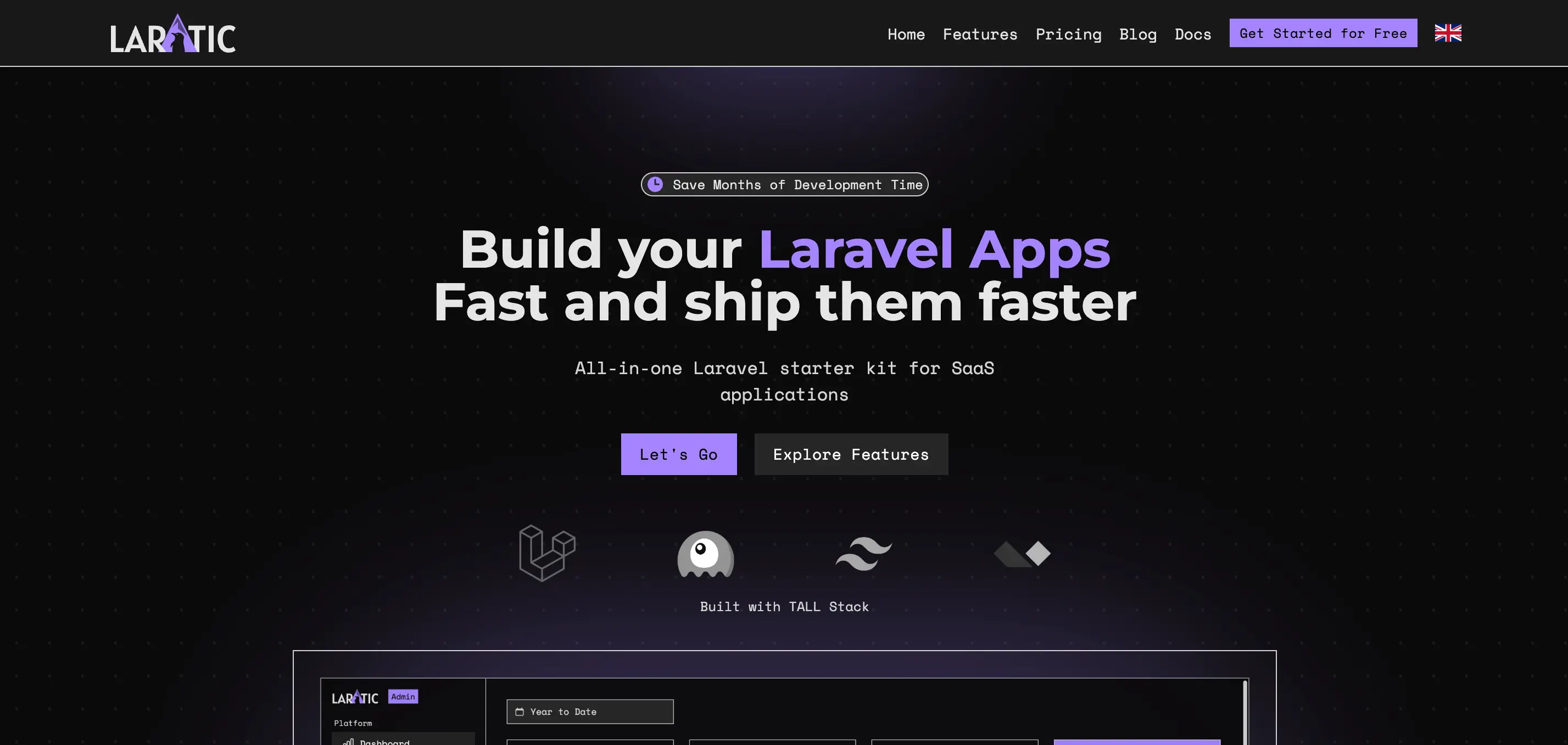
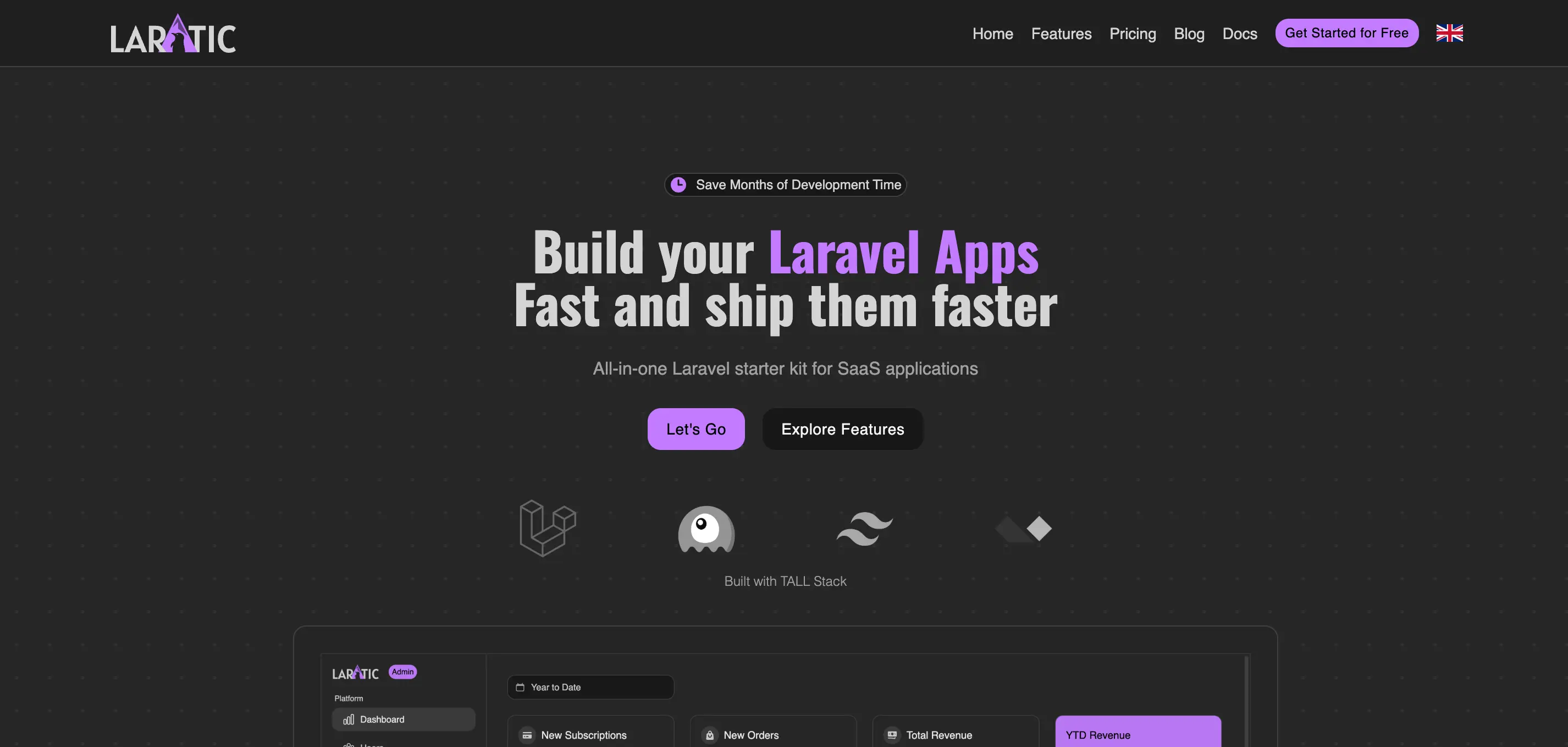
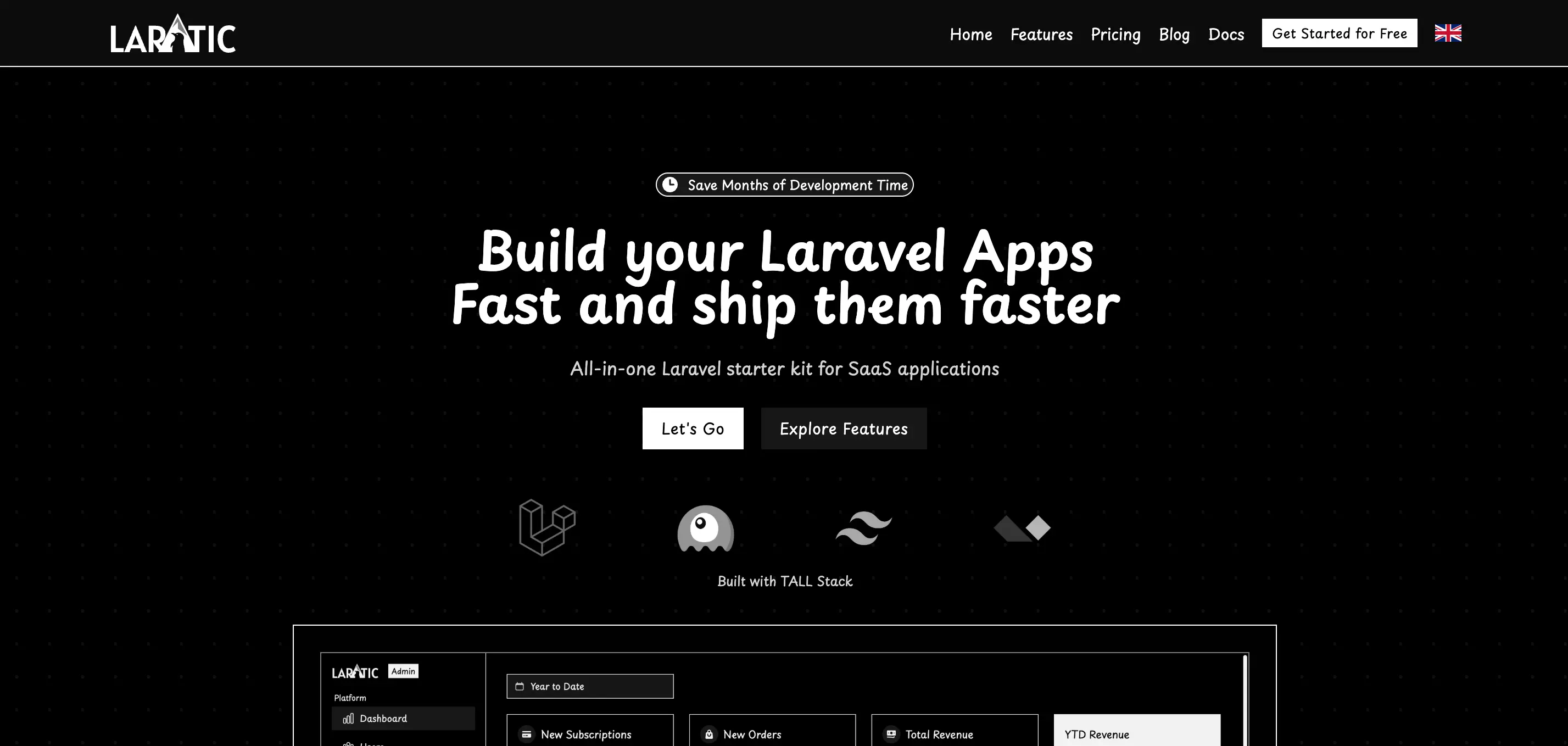
Zombie
Dark, eerie theme with Montserrat and Denk One fonts
zombie
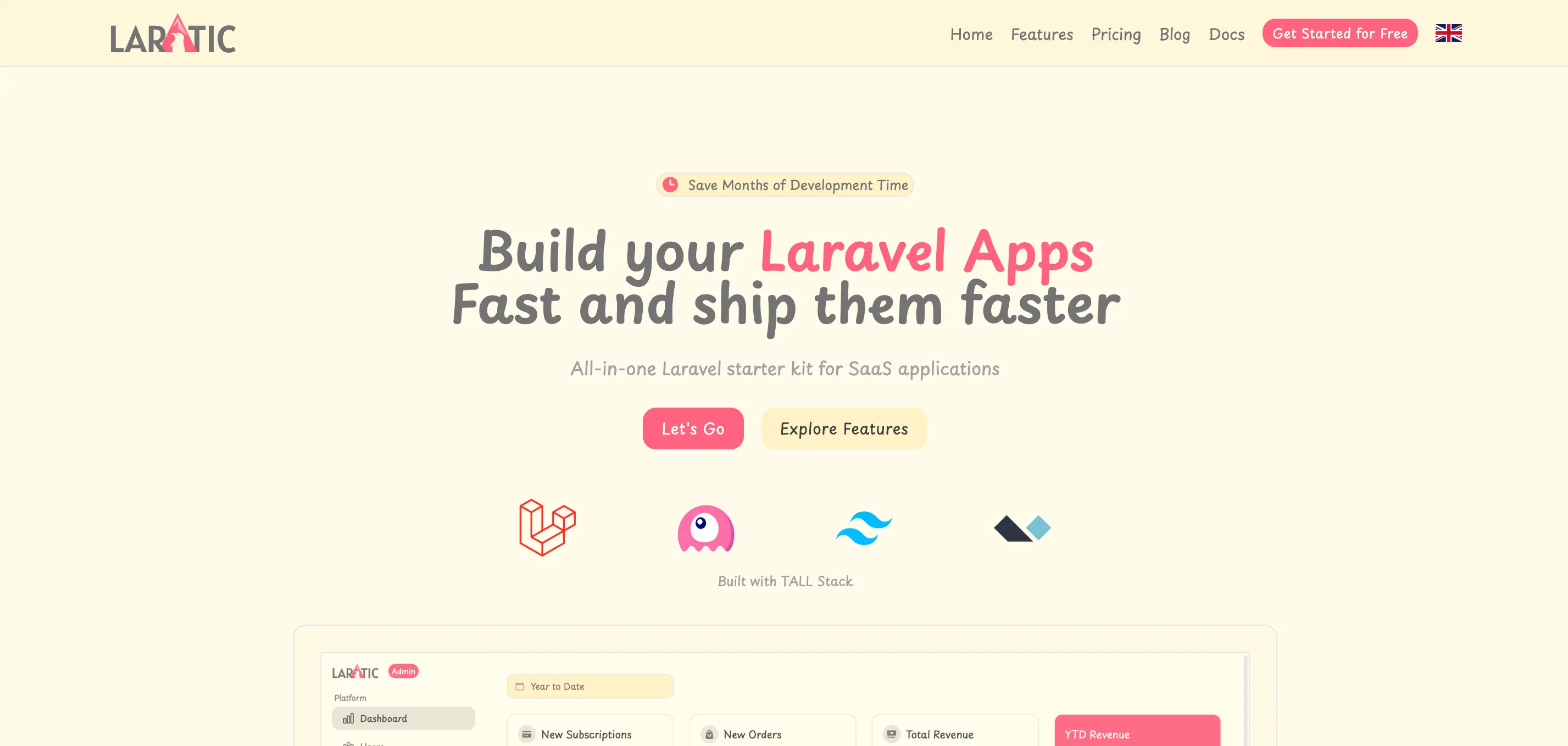
Pastel
Soft pastel colors with Playpen Sans font
pastel
Retro (90s)
Retro 90s aesthetic with Poppins and Oswald fonts
retro
Christmas
Festive theme with Lato and Jost fonts
christmas
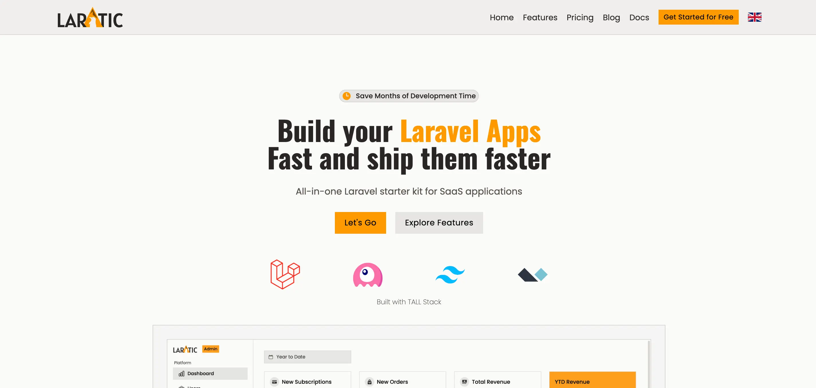
Prototype
Prototype/wireframe style with Playpen Sans font
prototype
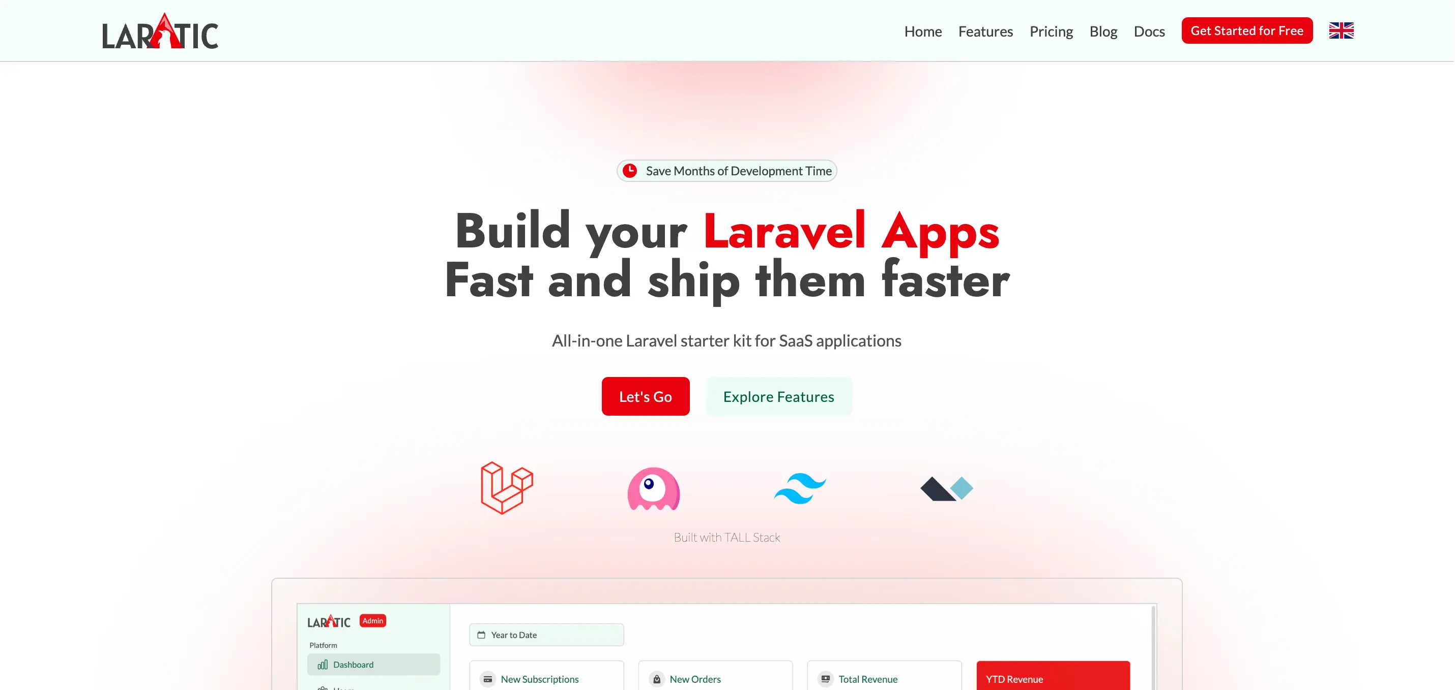
News
News website style with Inter and Merriweather fonts
news
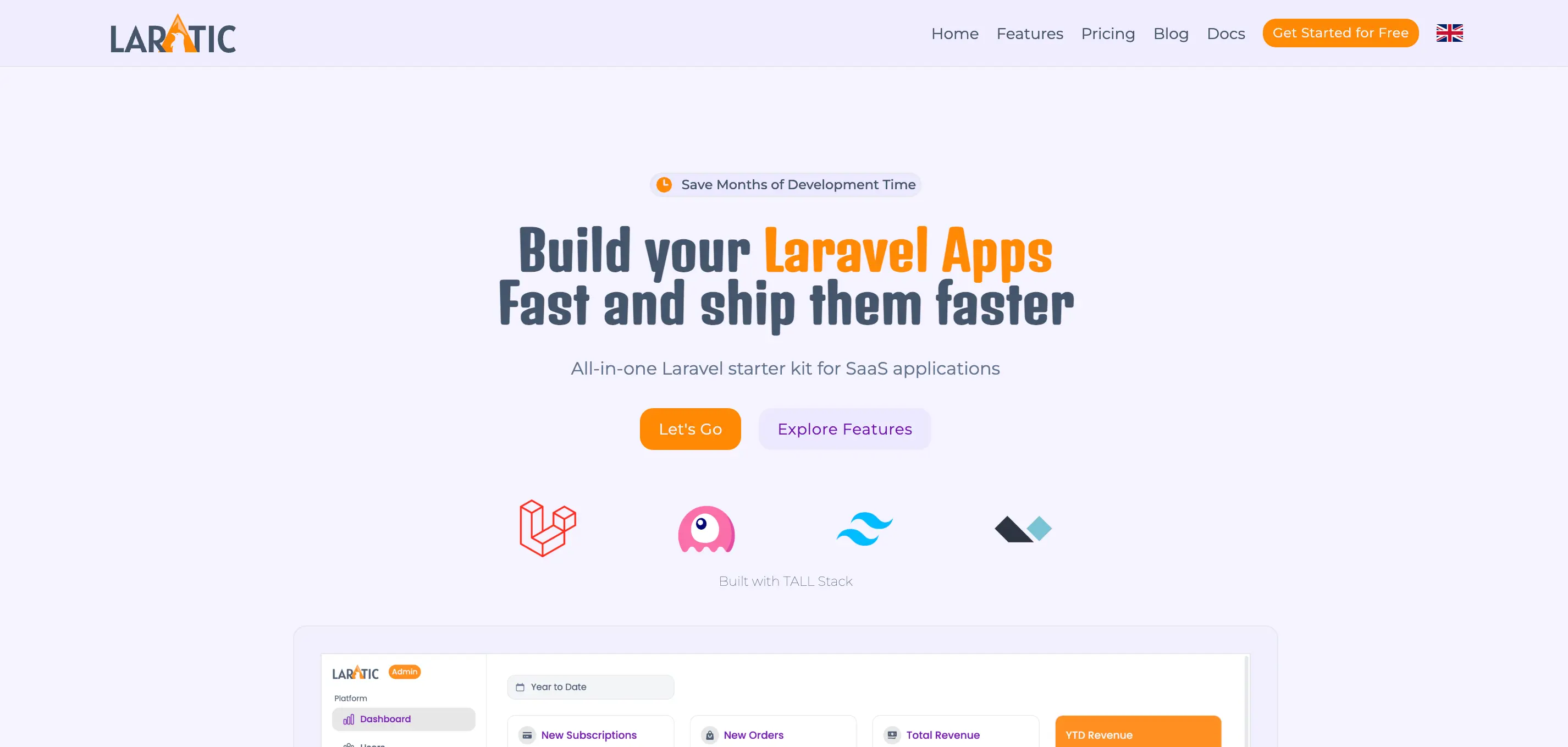
Industrial
Industrial design with Poppins and Oswald fonts
industrial
Font Management
You can edit the fonts in the resources/views/partials/head.blade.php. The system automatically loads only the fonts needed for the active theme.
Customizing Themes
All theme definitions are located in resources/css/app.css. Each theme is defined using CSS custom
properties (variables) within a [data-theme=theme-name] selector.
Theme Structure
Each theme includes the following customizable properties:
- Fonts -
--font-bodyand--font-title - Light Theme Colors:
--color-surface- Background color--color-surface-alt- Alternate background--color-on-surface- Text color--color-on-surface-strong- Strong text color--color-on-surface-muted- Muted text color--color-primary- Primary brand color--color-on-primary- Text on primary color--color-secondary- Secondary brand color--color-on-secondary- Text on secondary color--color-outline- Border/outline color--color-outline-strong- Strong border color
- Dark Theme Colors - Same properties with
-darksuffix - Shared Colors -
--color-info,--color-success,--color-warning,--color-danger - Border Radius -
--radius-radius
Creating a Custom Theme
To create your own custom theme, add a new theme block in resources/css/app.css:
[data-theme=my-custom-theme] {
    /* Fonts */
    --font-body: 'Your Font', sans-serif;
    --font-title: 'Your Font', sans-serif;

    /* Light Theme */
    --color-surface: var(--color-white);
    --color-surface-alt: var(--color-slate-100);
    --color-on-surface: var(--color-slate-700);
    --color-on-surface-strong: var(--color-black);
    --color-on-surface-muted: var(--color-neutral-500);
    --color-primary: var(--color-indigo-600);
    --color-on-primary: var(--color-slate-100);
    --color-secondary: var(--color-indigo-700);
    --color-on-secondary: var(--color-slate-100);
    --color-outline: var(--color-slate-300);
    --color-outline-strong: var(--color-slate-800);

    /* Dark Theme */
    --color-surface-dark: var(--color-neutral-900);
    --color-surface-dark-alt: var(--color-neutral-800);
    --color-on-surface-dark: var(--color-neutral-300);
    --color-on-surface-dark-strong: var(--color-white);
    --color-on-surface-dark-muted: var(--color-neutral-400);
    --color-primary-dark: var(--color-indigo-500);
    --color-on-primary-dark: var(--color-neutral-50);
    --color-secondary-dark: var(--color-blue-500);
    --color-on-secondary-dark: var(--color-neutral-100);
    --color-outline-dark: var(--color-neutral-700);
    --color-outline-dark-strong: var(--color-neutral-300);

    /* Shared Colors */
    --color-info: var(--color-blue-500);
    --color-on-info: var(--color-white);
    --color-success: var(--color-green-600);
    --color-on-success: var(--color-white);
    --color-warning: var(--color-amber-500);
    --color-on-warning: var(--color-white);
    --color-danger: var(--color-red-600);
    --color-on-danger: var(--color-white);

    /* Border Radius */
    --radius-radius: var(--radius-sm);
}
Then set APP_THEME=my-custom-theme in your .env file, and add the corresponding font
link in resources/views/partials/head.blade.php if needed.
Theme Variables Reference
Here's a quick reference of all available theme variables:
| Variable | Description |
|---|---|
--font-body |
Font family for body text |
--font-title |
Font family for headings and titles |
--color-surface |
Main background color (light mode) |
--color-surface-alt |
Alternate background color (light mode) |
--color-on-surface |
Main text color (light mode) |
--color-on-surface-strong |
Strong/emphasized text color (light mode) |
--color-on-surface-muted |
Muted/secondary text color (light mode) |
--color-primary |
Primary brand color (light mode) |
--color-on-primary |
Text color on primary background (light mode) |
--color-secondary |
Secondary brand color (light mode) |
--color-on-secondary |
Text color on secondary background (light mode) |
--color-outline |
Border/outline color (light mode) |
--color-outline-strong |
Strong border color (light mode) |
--color-*-dark |
All above variables with -dark suffix for dark mode |
--color-info |
Info message color |
--color-success |
Success message color |
--color-warning |
Warning message color |
--color-danger |
Error/danger message color |
--radius-radius |
Default border radius for rounded elements |