Avatar Component
The Avatar component displays user profile images with automatic fallback handling. It supports multiple sizes, variants, and custom content.
Usage
The simplest way to use the avatar component with an image:
<x-avatar img="/images/avatars/avatar-1.webp" alt="User Avatar" />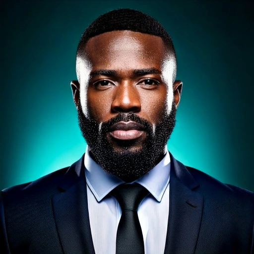
Sizes
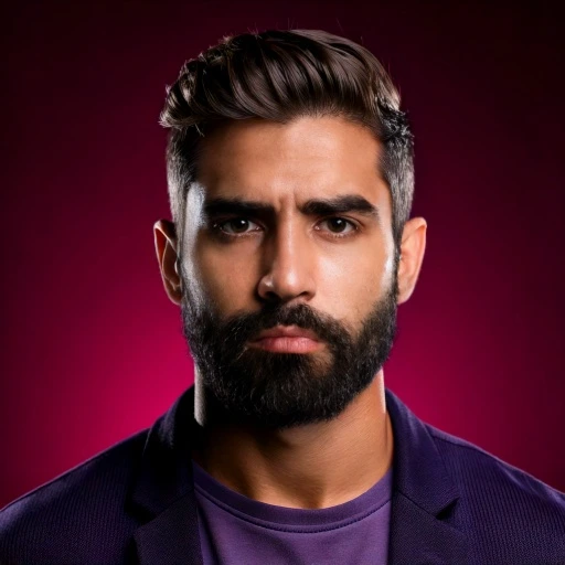
The avatar component supports six different sizes:
<x-avatar size="xs" img="/images/avatars/avatar-2.webp" />
<x-avatar size="sm" img="/images/avatars/avatar-3.webp" />
<x-avatar size="md" img="/images/avatars/avatar-4.webp" />
<x-avatar size="lg" img="/images/avatars/avatar-5.webp" />
<x-avatar size="xl" img="/images/avatars/avatar-6.webp" />
<x-avatar size="2xl" img="/images/avatars/avatar-7.webp" />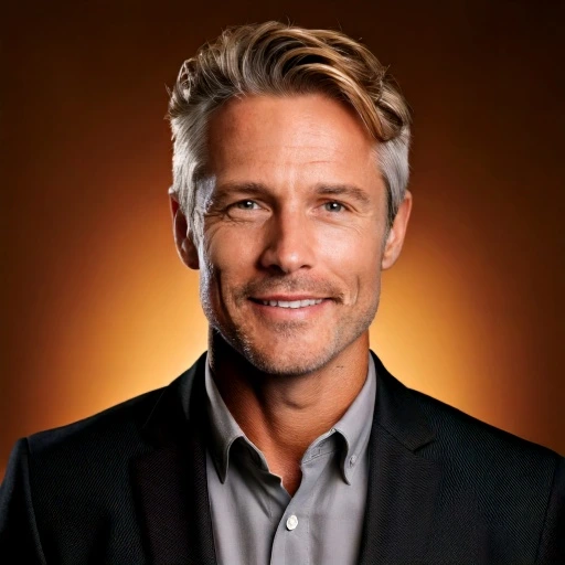
Variants
When no image is provided or when an image fails to load, the avatar displays a fallback with different color variants:
<x-avatar variant="default" />
<x-avatar variant="primary" />
<x-avatar variant="secondary" />
<x-avatar variant="info" />
<x-avatar variant="success" />
<x-avatar variant="warning" />
<x-avatar variant="danger" />
<x-avatar variant="inverse" />
With Initials
Use the fallback prop to display user initials or custom text:
<x-avatar fallback="JD" variant="primary" />
<x-avatar fallback="SM" variant="secondary" />
<x-avatar fallback="AB" variant="info" />
JD
SM
AB
Image with Fallback
When an image URL is provided but fails to load, the avatar automatically shows the fallback:
<x-avatar img="invalid-url.jpg" fallback="JD" variant="danger" />
Square Shape
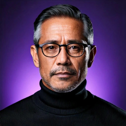
By default, avatars are circular. Set :isCircle="false" for rounded squares:
<x-avatar :isCircle="false" img="/images/avatars/avatar-4.webp" />
<x-avatar :isCircle="false" fallback="SQ" variant="primary" />Props Reference
| Prop | Type | Default | Description |
|---|---|---|---|
size |
string | md |
Avatar size. Options: xs, sm, md, lg,
xl, 2xl |
variant |
string | default |
Color variant for fallback. Options: default, primary,
secondary, info, success, warning,
danger, inverse |
img |
string|null | null |
Image URL. If the image fails to load, the fallback will be displayed automatically. |
alt |
string | Avatar |
Alternative text for the image for accessibility. |
isCircle |
bool | true |
Whether the avatar should be circular. Set to false for rounded squares. |
fallback |
string|null | null |
Fallback text (e.g., user initials) to display when no image is provided or when the image fails to load. |
Slots
| Slot | Description |
|---|---|
| Default slot | Custom content displayed in the fallback state. Useful for custom icons or badges. If no slot content is provided, a default user icon will be shown. |
References
| Category | Path / Name | Description |
|---|---|---|
| Component | resources/views/components/avatar.blade.php | Avatar component file |
For the detailed documentation, please visit the Penguin UI Avatars.